home / Tips & Tricks / #
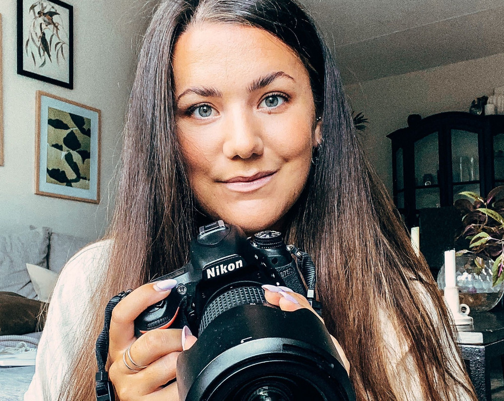
3 Tips for Taking Better Photos
Our very own photographer, Sofie, shares her top tips for creating a stunning shot with a few simple tricks.
#Bullet Journaling #Guides and Tips
Struggling to recreate that cool-looking shot you see in your head? Learn how you can compose beautiful pictures with just a few simple tricks from a professional photographer.

Sofie is responsible for most of the photos, videos and tutorials you see in our social media accounts, and with the help of her tips, you’ll be able to snap better pictures and confidently design stunning-looking planner and Mixbook™ covers in no time.
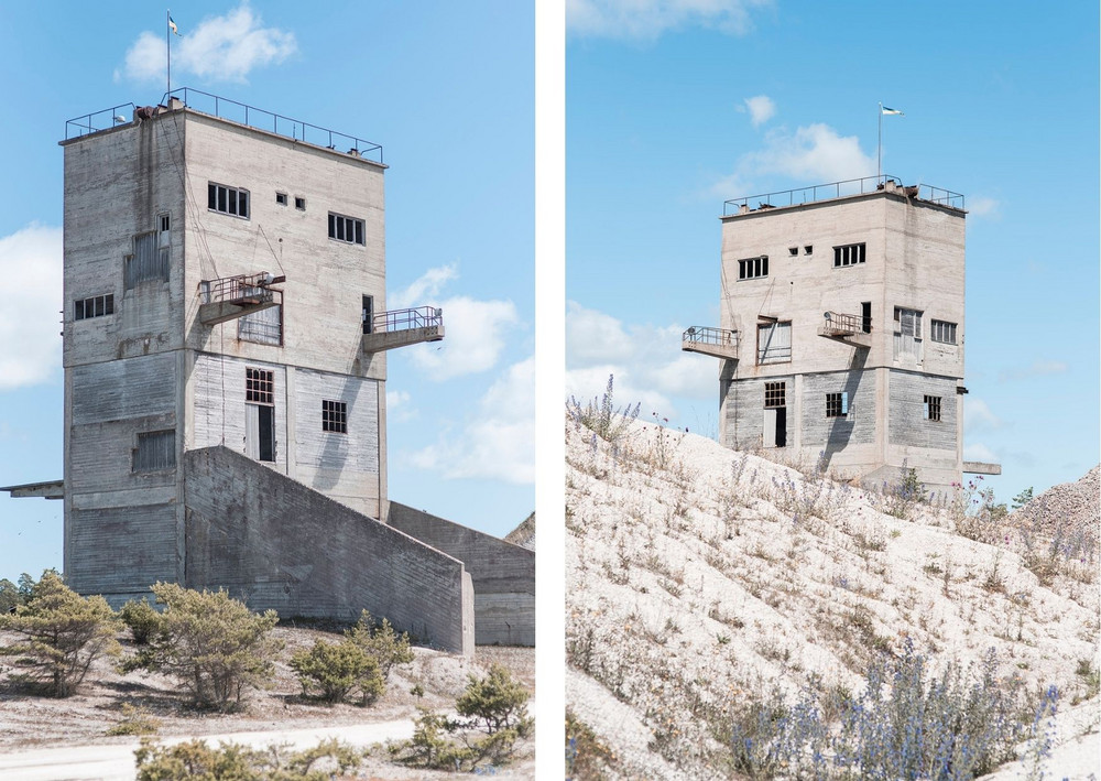
“If you’re a person who’s really into perfectly symmetrical shots, try a more asymmetric angle for your next photo. This way, you’ll create a new kind of balance in the picture. There’s no right or wrong here, so dare trying to see things from a different perspective than you normally do.”
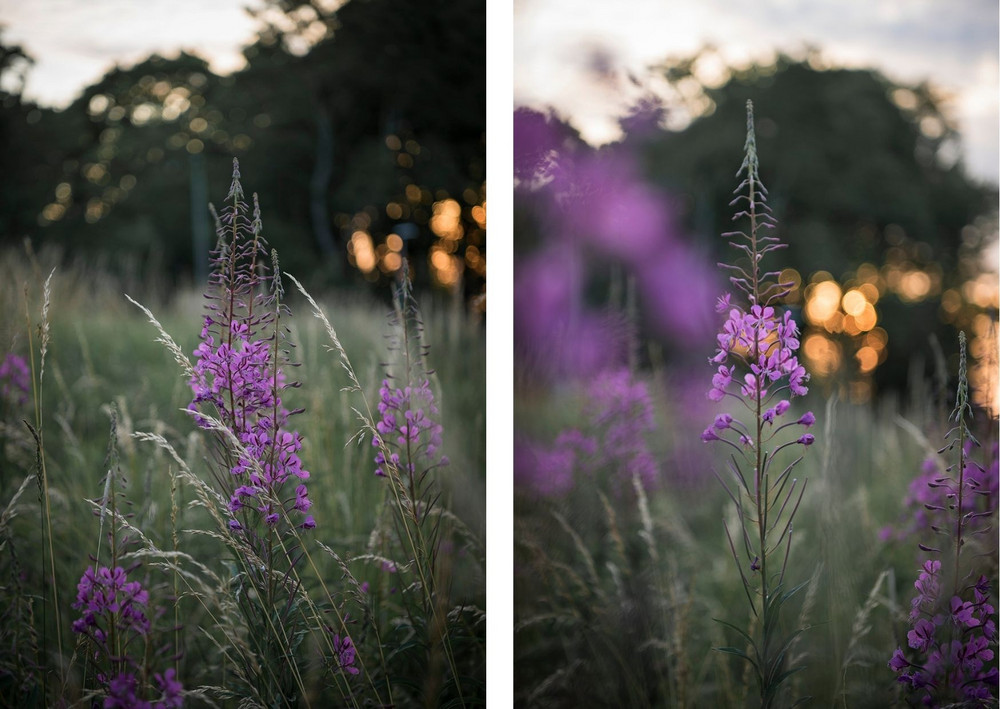
“A simple way of creating more depth in a photo is by experimenting with foregrounds. You could also ‘cheat’ and just hold a bit of greenery in front of the lens to get the same effect. The blurry foreground will add a professional touch to your picture and make it look more alive.”
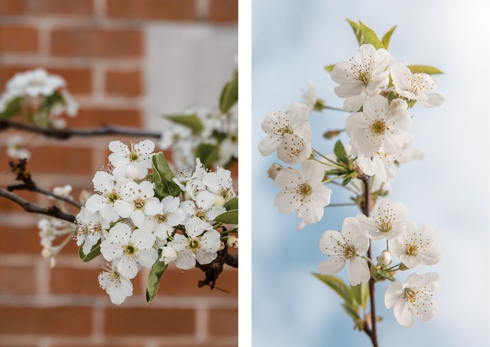
“To minimise noise in a photo, a great idea is to snap the picture from an angle where the background is as ‘clean’ as possible. This way, your picture will appear more harmonious. You don’t need to go overboard and start rearranging the entire room, or clearing the forest from branches and debris - sometimes just turning your eye in a different direction is enough.”
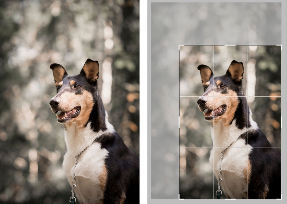
“Sometimes there just isn’t enough time to create the best composition possible during a shoot, but that doesn’t stop you from ‘correcting’ things afterwards. Try cropping your photo following the rule of thirds*, and place your object in any of the four points where the lines intersect.”
*The rule of thirds is a composition guide where you divide your screen into nine squares or rectangles with the help of vertical and horizontal lines. You can easily turn on this grid on your phone’s camera, via Settings.
This composition rule can also come in handy when placing your image on your next Mixbook™ or planner cover!
“Good luck with your photos - I look forward to seeing your gorgeous cover creations on Instagram under our hashtag #itsprettypersonal!”
Our blog: Tips & Tricks
Create a Personalised Guest Book for Your Summer or Winter Cottage
With our personalised notebook, you can tailor your own unique guest book and fill it with everything from important contact details to cosy holiday stories and smart checklists.
5 Smart Ways to Use Your Planner More Than Just a Calendar
Get the most out of your planner! Discover 5 creative ways to use it from habit tracking to meal planning. Read our top tips!
Build a Planning Habit That Lasts For Less Stress and More Structure
Building good habits sounds simple, but we all know how quickly they can slip away. One of the most important habits for a balanced, productive life is planning. When you take the time to plan, you create structure, reduce stress, and gain more control over your day.


